Last updated: 10 / 11 / 2025
The group has a unique logo, universal and adaptable to the industrial sector,
but above all, in line with your brand promise.
SUMMERRNITY Systems was created to offer a wide range of sustainable solutions in phase
with the environmental and industrial challenges of today and tomorrow.
The brand name “ETERNITY" recalls that the mission of ETERNITY Systems is to innovate
permanently by offering industrial services aligned with societal concerns.
Together we designed a logo with a simple, clean design, which ensures that it will remain timeless.
It works on all backgrounds: in color, or in black and white.
The logo design is based on the letter “ R with a distinct shade of blue. This blue refers to the core business
industrial washing ETERNITY Systems while being anchored in a strong and organized international logistics.
At lettre R is highlighted. R as " Refuse”: refuse classic codes that harm business performance
and our customers. THE R also refers to Rethink, Reducate Rshe, Repair Recycle: circular economy solutions at the center of our
activity and cornerstone of our value proposition.
The simplicity of the design also makes it flexible enough to have different interpretations in the future.
It tells our clients that we are investing for the future by offering them innovative and successful methods.
This new presentation gives the dynamics of ETERNITY Systems
an even stronger sense of consistency and solidity over time.

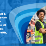
Communications and Marketing Manager at ETERNITY Systems, Anthony designs strategies and content to promote more sustainable consumption. He is a committed agent of change who combines creativity, rigor, and action to strengthen the visibility and impact of projects related to reuse and the circular economy.
- Anthony ADAM

- Anthony ADAM
- Anthony ADAM
- Anthony ADAM
- Anthony ADAM
- Anthony ADAM
- Anthony ADAM
- Anthony ADAM
- Anthony ADAM
- Anthony ADAM
- Anthony ADAM
- Anthony ADAM
- Anthony ADAM
- Anthony ADAM
- Anthony ADAM
- Anthony ADAM
- Anthony ADAM
- Anthony ADAM
- Anthony ADAM
- Anthony ADAM
- Anthony ADAM
- Anthony ADAM
- Anthony ADAM
- Anthony ADAM
- Anthony ADAM
- Anthony ADAM
- Anthony ADAM
- Anthony ADAM
- Anthony ADAM
- Anthony ADAM
- Anthony ADAM
- Anthony ADAM
- Anthony ADAM
- Anthony ADAM
- Anthony ADAM
- Anthony ADAM
- Anthony ADAM
- Anthony ADAM
- Anthony ADAM
- Anthony ADAM
- Anthony ADAM
- Anthony ADAM
- Anthony ADAM
- Anthony ADAM
- Anthony ADAM
- Anthony ADAM
- Anthony ADAM
- Anthony ADAM
- Anthony ADAM
- Anthony ADAM
- Anthony ADAM
- Anthony ADAM
- Anthony ADAM
- Anthony ADAM
- Anthony ADAM
- Anthony ADAM
- Anthony ADAM
- Anthony ADAM
- Anthony ADAM
- Anthony ADAM
- Anthony ADAM
- Anthony ADAM
- Anthony ADAM
- Anthony ADAM
- Anthony ADAM
- Anthony ADAM
- Anthony ADAM
- Anthony ADAM
- Anthony ADAM
- Anthony ADAM
- Anthony ADAM
- Anthony ADAM
- Anthony ADAM
- Anthony ADAM


You may also be interested in these articles:
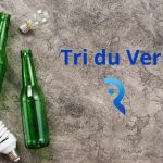
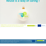
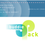
 ETERNITY Systems puts its industrial expertise at the service of the deployment of the reuse of primary packaging
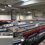
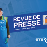
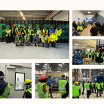
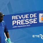
 ETERNITY Systems’ News – A look back at the year 2023
 First 100% electric truck transport of packaging for ETERNITY Systems